Tag: Art Direction

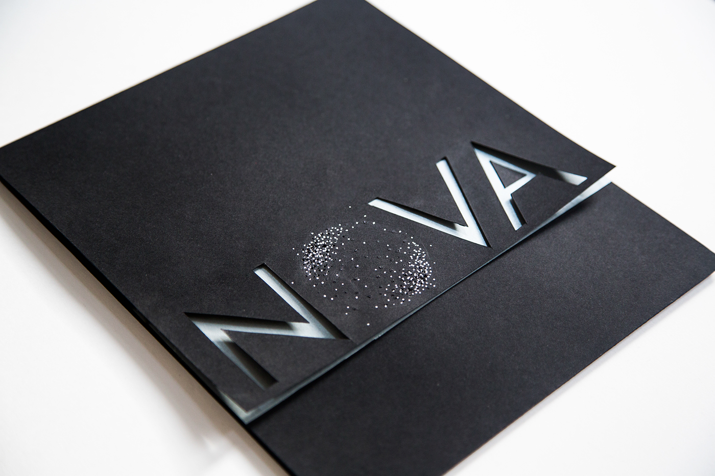
NOVA Brand Identity
Brand identity for a hypothetical space travel airline, NOVA. Libby Tsoi and Ben Hutchings decided to create the identity for a conceptual high-end luxury air service that would fly its patrons across the solar system. Here you are their wonderful artwork!

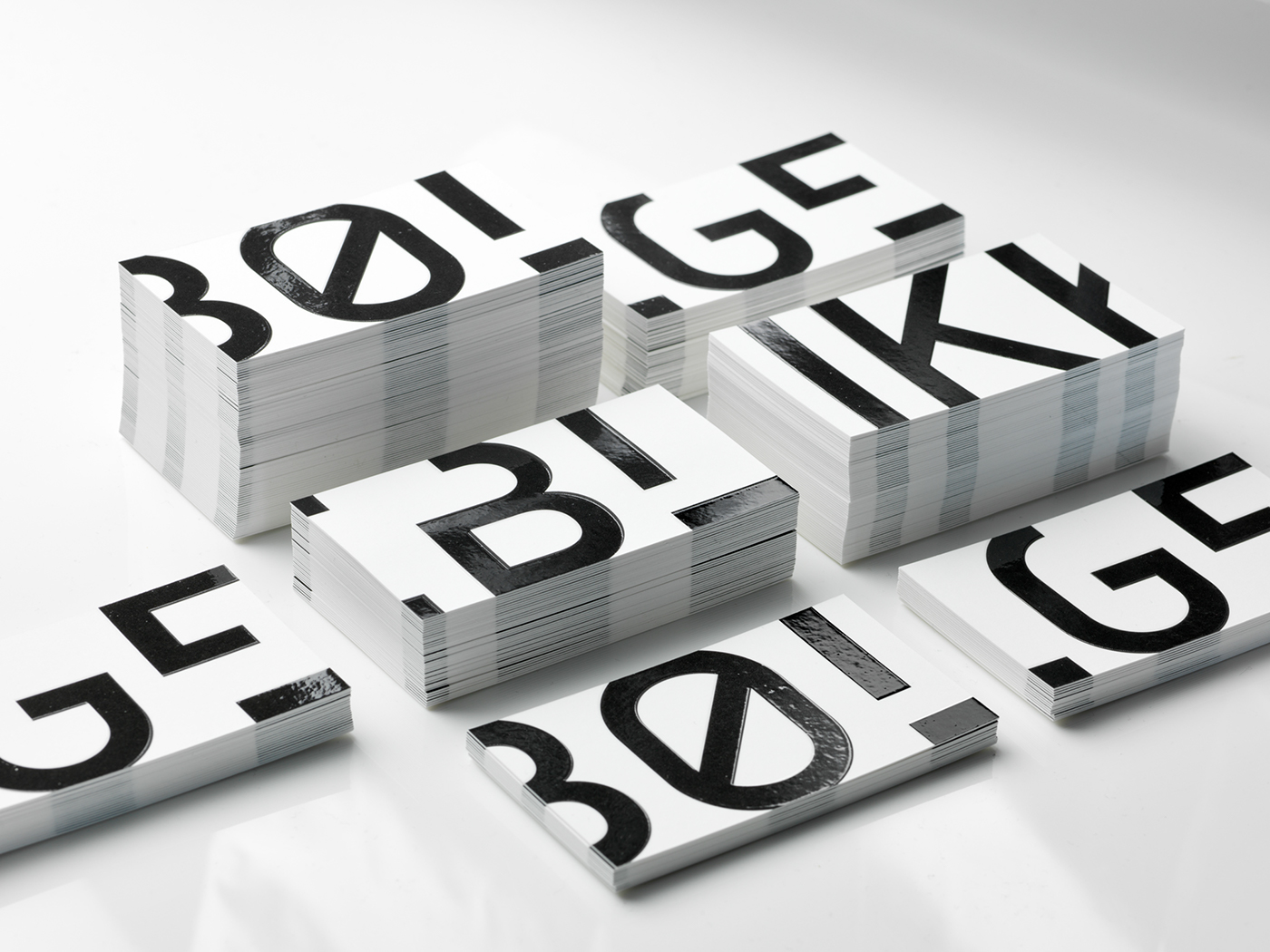
BØLGEBLIKK Visual Identity
Tank Design developed a new name, visual identity and website for the architecture agency former known as Ottar Arkitekter. Their aim was to develop an identity where quality and professionalism is expressed. Tank Design also wanted the identity to reflect the monumental buildings the agency works with. Maintaining an innovative and modern expression was essential to…

Spotlight Festival Identity
Spotlight is a summer beach festival which was held in Helsinki in summer 2017. Manitou‘s task was to create a vivid modular design that works well with photos and looks good in the urban environment and in nature. The main theme of identity design is stylization of light spots and the searchlight beams, their overlapping.…

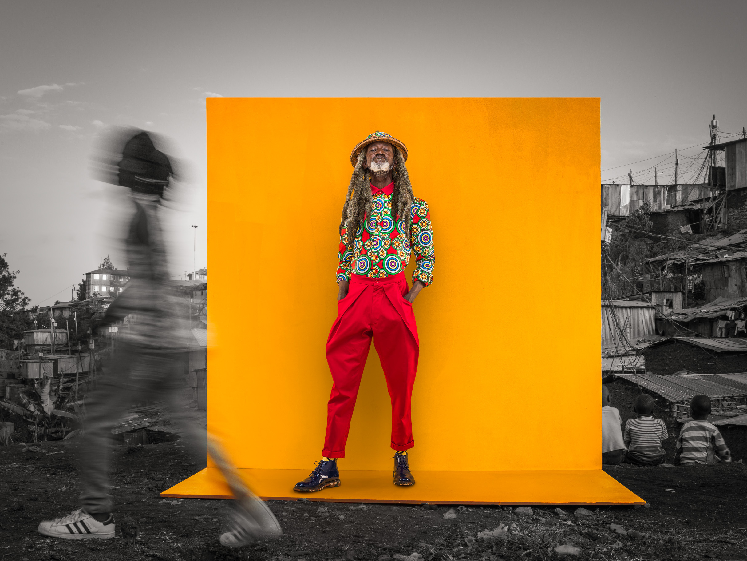
The Return Of The Rude-Boy
This is a tribute to Kevo Abbra’s father by his former friends and colleagues in the tailoring industry in the ghetto who began fusing their own designs with the readily available thrift-store collectables. Every now and then they set up tribute shows in different hoods in Nairobi and model their latest collections, a testimony to…

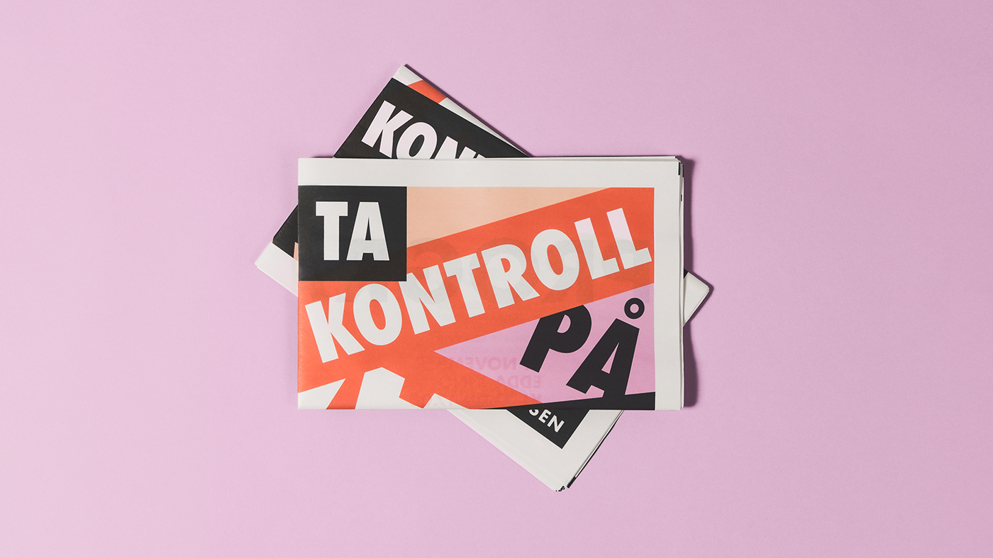
!Konferanse Visual Identity
!Konferansen is a new Norwegian conference for women, by women. The conference aims to provoke change and inspire growth—setting focus on strong women and their stories. The conference will consist of a series of lectures, debates and discussions. Larssen & Amaral were tasked with creating the new visual identity and marketing materials. Larssen & Amaral is…

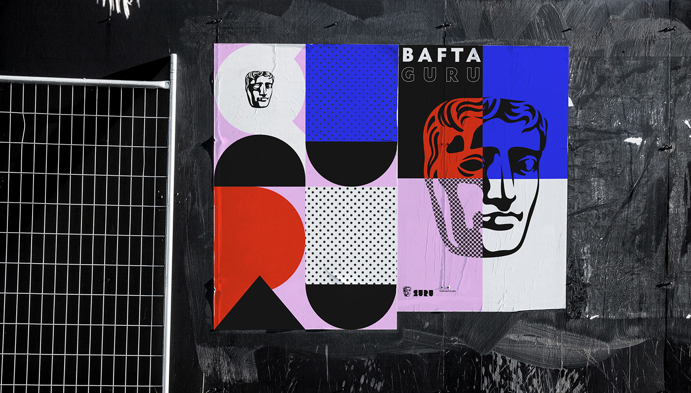
BAFTA Guru Identity System
BAFTA Guru is BAFTA’s content hub for career starters packed full of inspirational videos, podcasts and interviews, providing a platform for budding talent in TV, Film and Gaming to get advice, inspiration and guidance from those at the very top of those industries. An extensive and excellently curated selection of video interviews with the great…

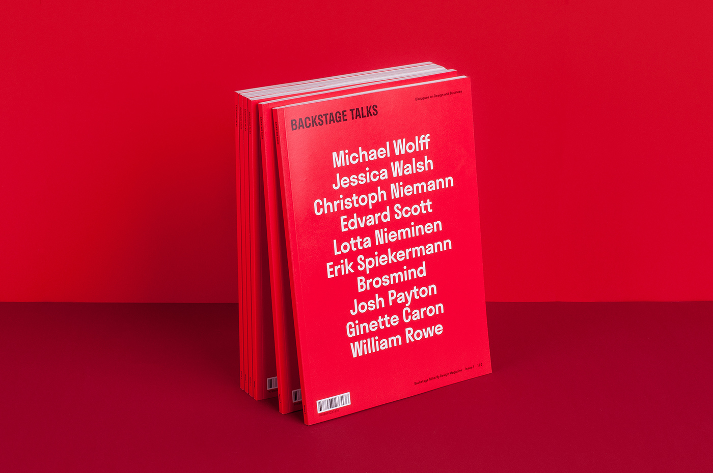
Backstage Talks Magazine
Being magazine lovers themselves, creating Backstage Talks was a delight and a major lesson for Milk. From the very beginning, They had a clear goal — to make Backstage Talks outstanding. From both editorial and design perspectives. Not exactly an easy task. The challenge for Milk was to craft the art direction in a way that will…

‘Akade’ T-Shirt Retro Designs Made By James White
James White has a blast working with Akade to develop these retro designs, heavy with the influence of synthwave. You can check them out and more 80s themes streetwear in the Akade store. James White was born in 1977 and calls Dartmouth, Nova Scotia, Canada his home. His parents were never able to keep typewriter…

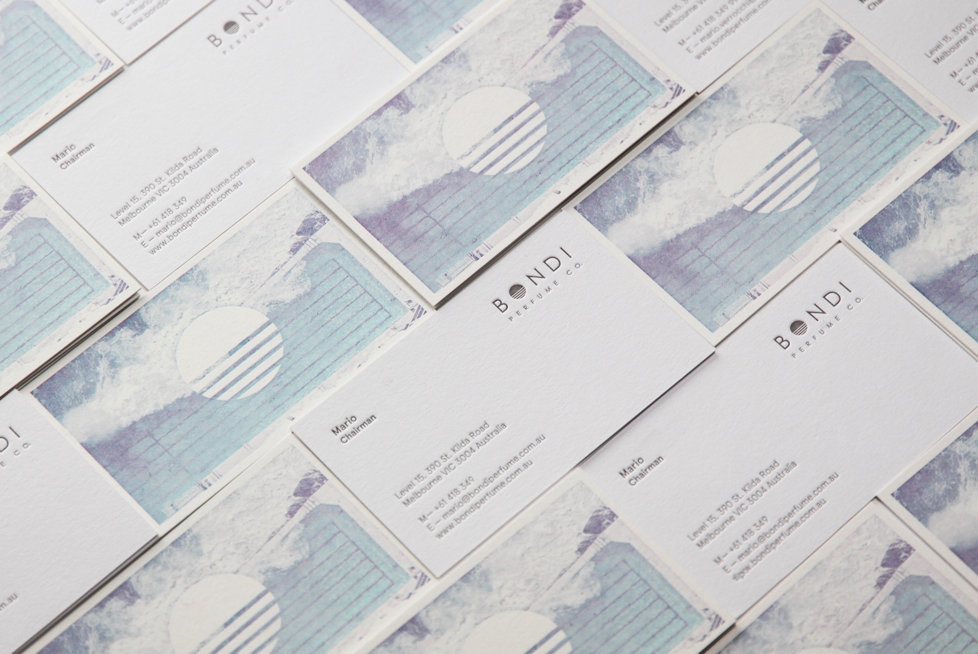
Bondi Perfume Co. Branding
An identity for the Bondi Perfume Co., designed by DOB Creative, that references the iconic imagery of Icebergs in Bondi as inspiration for the logo and branding materials. The tiles in the pool are mirrored in the logo design and is expressed throughout. Business Cards printed by The Hungry Workshop. DOB Creative is a creative agency, based…

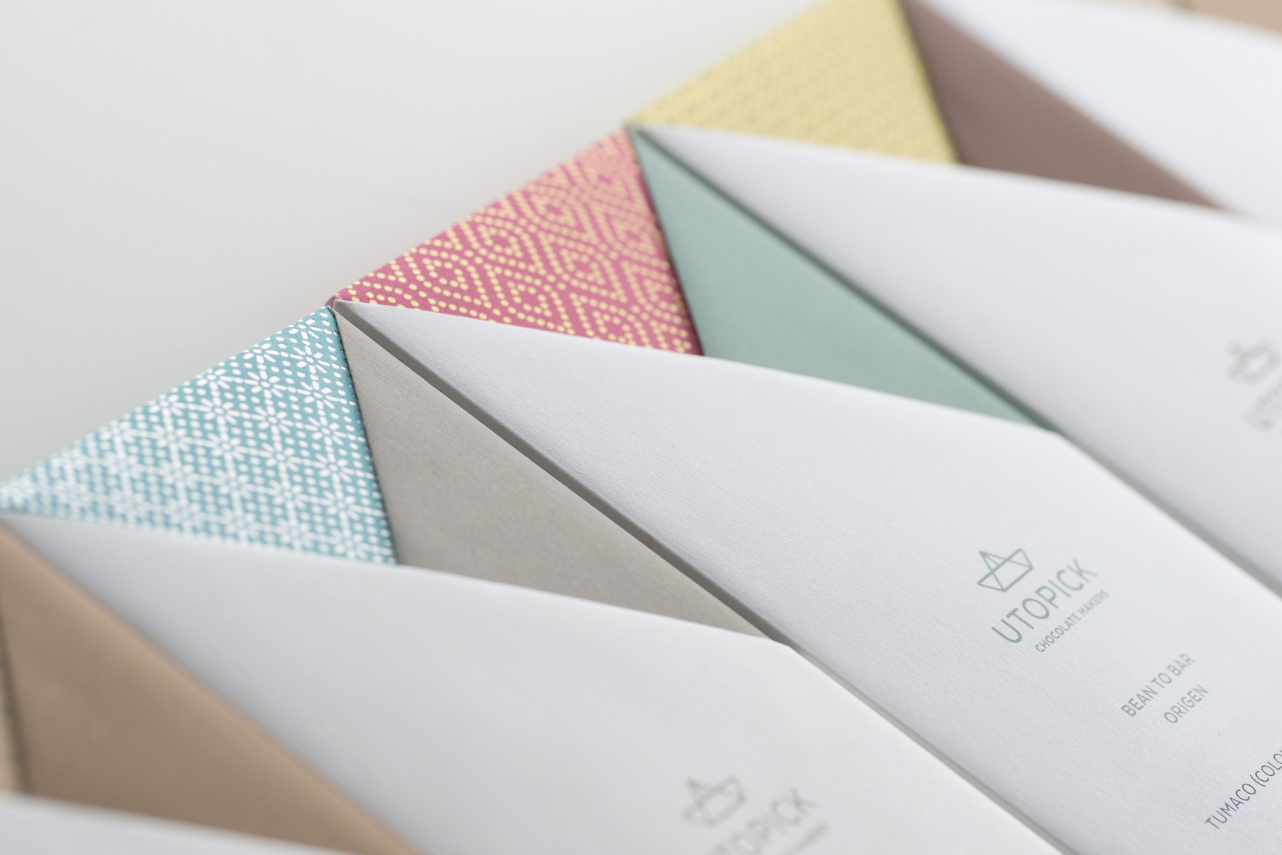
Utopick Chocolates Corporate Identity, Packaging & Chocolate Bar
Paco Llopis is a master chocolatier. An ingenious craftsman constantly searching for new discoveries in flavors, textures and filling techniques in the world of “bean-to-bar”- an artisanal craft produced entirely under the makers control, in this case, using selected cocoa pods bought directly from local producers in Colombia and other Latin American countries. He came…

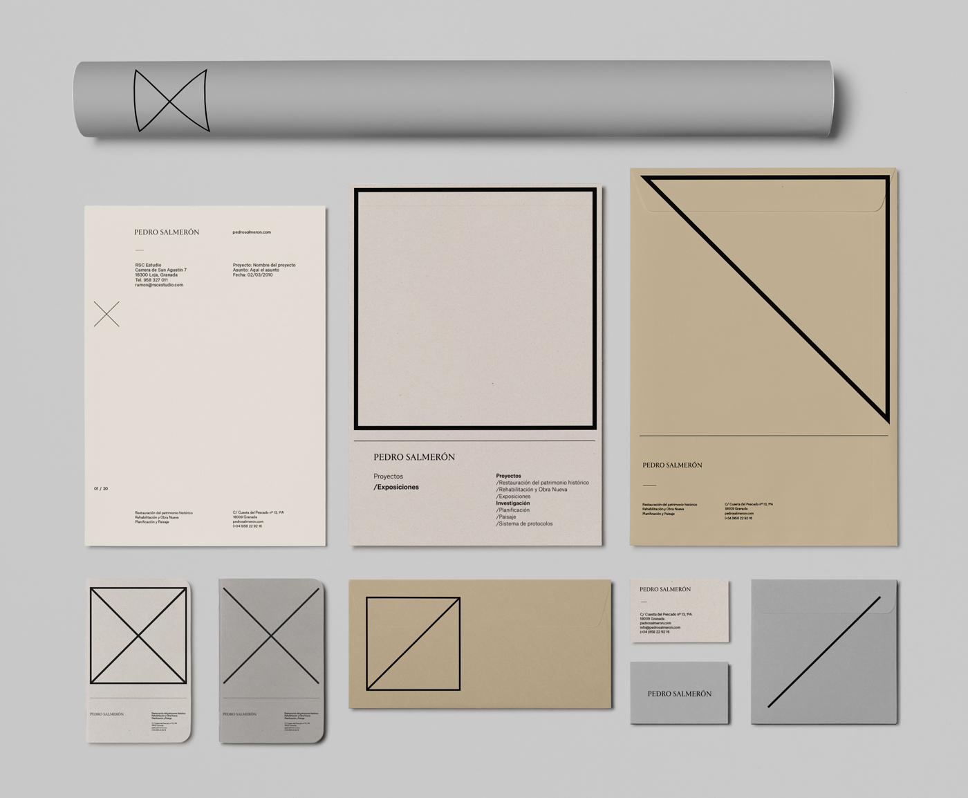
Pedro Salmerón’s New Branding
A life among scaffolding. This way you can summarize Pedro Salmerón’s professional career. This reputed Spanish architect, specializing in historical heritage, commissioned Buenaventura Estudio with the development of a new brand for his architecture practice. The challenge was an important one. It demanded a visual identity able to accommodating the several aspects and types of…

Nike Back to School Patches
London based illustrator and designer Tim Easley is best known for his bright palette and bold lines, imaginatively fusing playful characters and hand drawn lettering. Having also worked stints in Tokyo and Seattle, Tim is influenced by urban kitsch, nature, and neon signage. He creates work both personally and commercially in a variety of mediums,…