
Tank Design developed a new name, visual identity and website for the architecture agency former known as Ottar Arkitekter. Their aim was to develop an identity where quality and professionalism is expressed. Tank Design also wanted the identity to reflect the monumental buildings the agency works with. Maintaining an innovative and modern expression was essential to them during the process. The final name: Bølgeblikk.
Bølgeblikk (eng. corrugated iron) is an intriguing and challenging choice of name, with strong connotations to inexpensive, rugged and rough use of materials. Bølgeblikk has traditionally been used in sheds, military barracks etc., but has recently experienced a renaissance among several young architects because of its unparalleled quality and flexibility. Upon dividing the name in two, the word Bølge (wave) and Blikk (glance) convey the contrast between movement and stillness, hard and soft, organic and constructed.
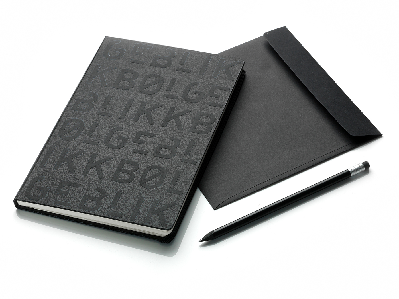
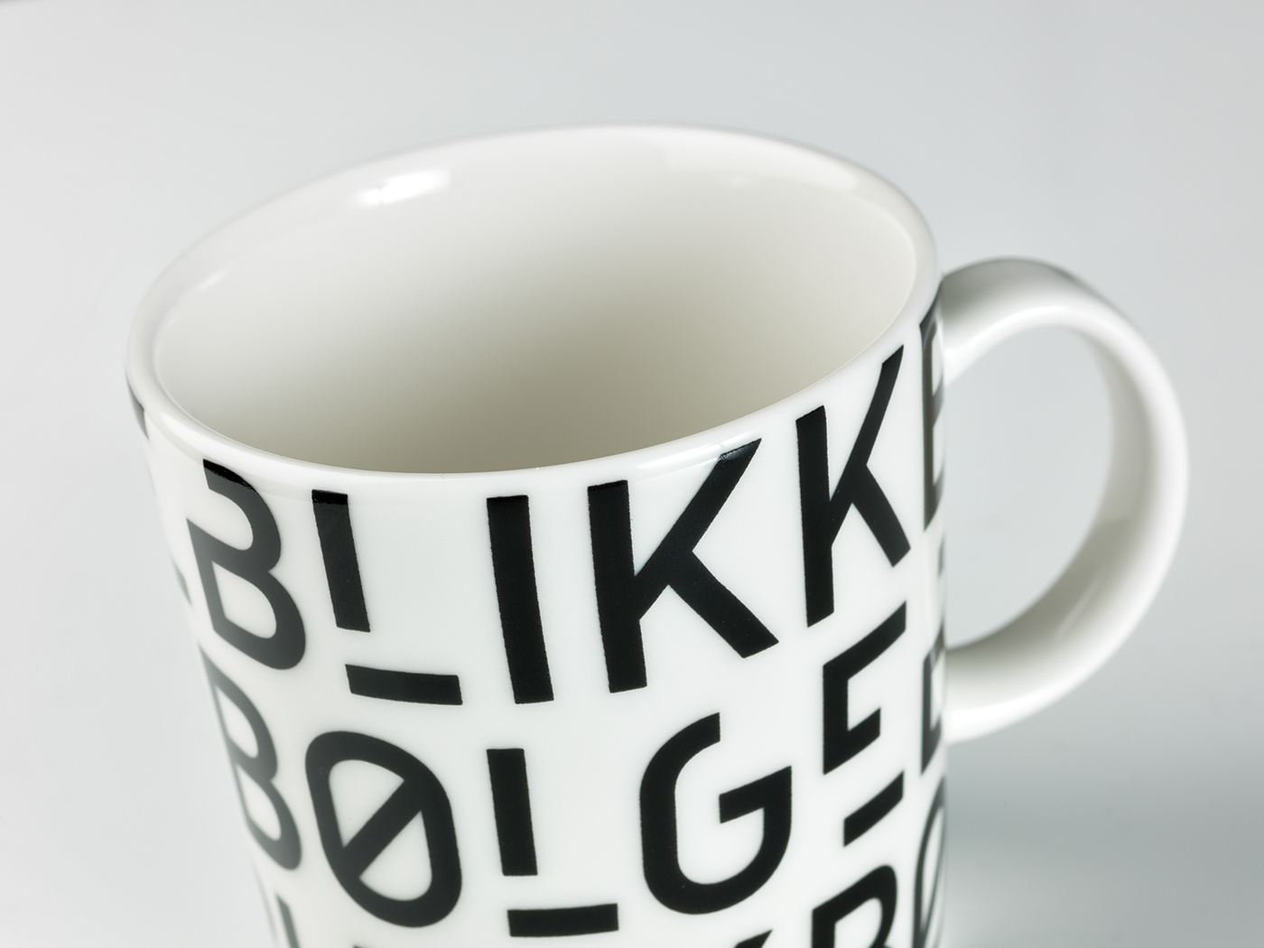
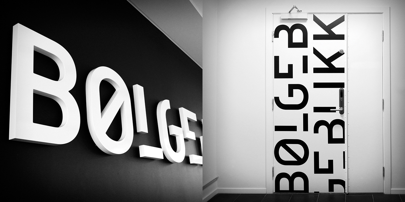
A complex name requires good legibility. By slightly deconstructing the letters, interesting spaces and contrasts appear amongst the letters. When the logo is assembled in patterns, it creates dynamic sections where the legibility of the letters disappears and the importance of the shapes increases.
Tank Design is a design agency with over 15 years experience in visual communication, based in Oslo, Norway.


Leave a Reply