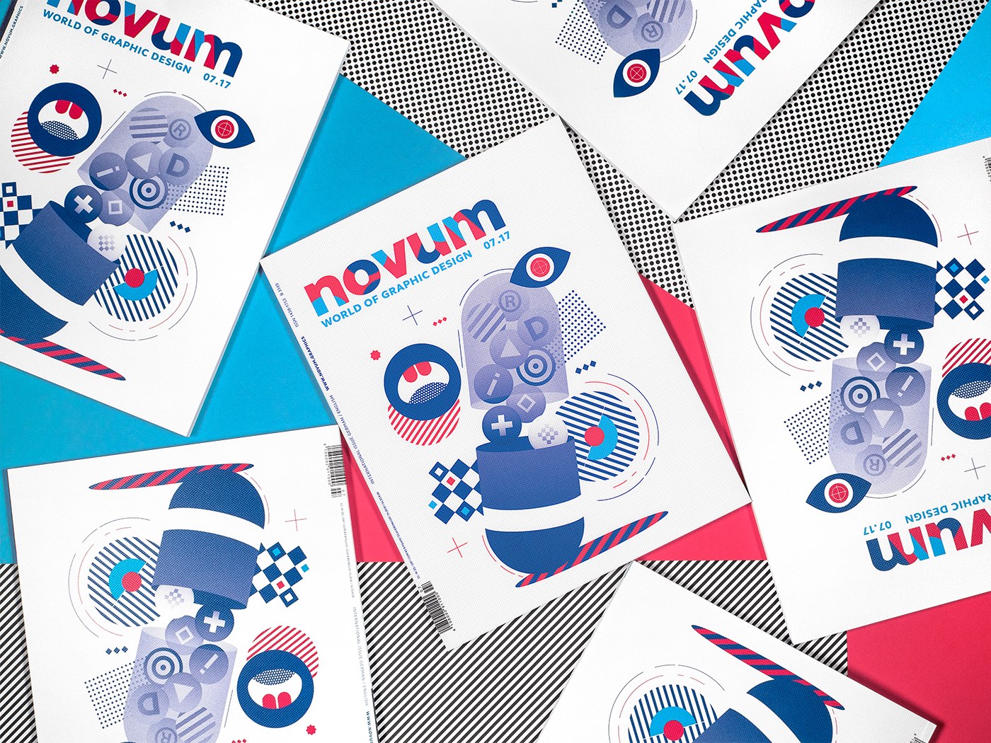
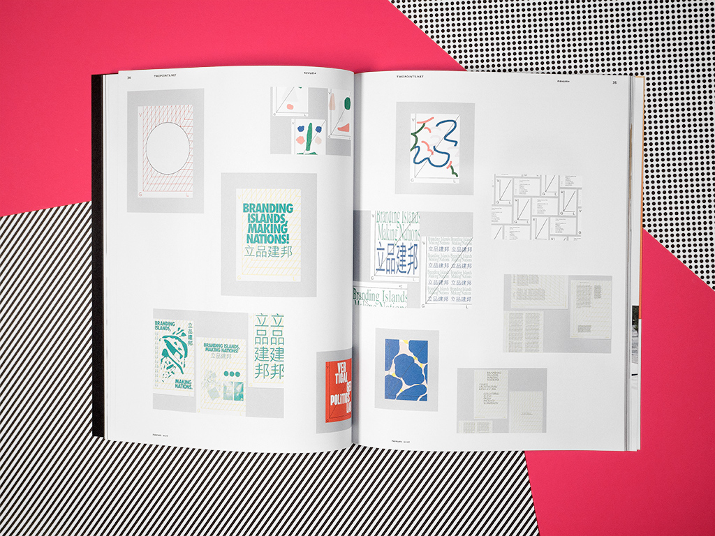
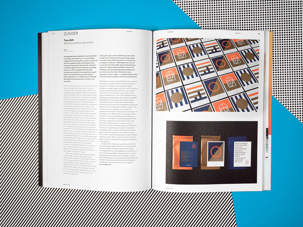
In this July’s focus theme of corporate identities Novum presents a particularly wide spectrum of examples from across a variety of sectors. How do you give a traditional bank a contemporary new look? Or make Twitter into a tangible experience? Also featured in this new issue of Novum are Studio Grau’s prize-winning designs, Diana Barbu’s delightful illustrations, the well-travelled designer Ginette Caron and the creatives at studio [Rowelt], serving international clients from a village location. Then, in part 2 of the series on “New Typography”, Novum takes a detailed look at the Bauhaus and the influence it still exerts to this day.
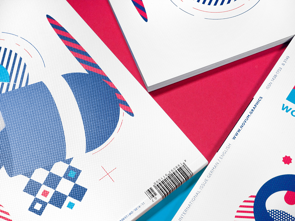
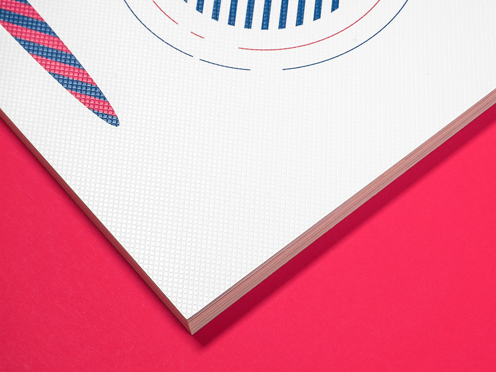
What better medium for the subject of corporate identity than a material that impresses in both overall look & feel and subtle detail? This time, on the July cover of novum, a neutral, radiant white combines with a fine surface structure to create a delightful and intriguing haptic experience.

Leave a Reply