
On a mission to grow better foods for you and the planet, Urban Barns deserved a brand platform that was both true to their high-tech growing technique and appealing to their health-conscious consumer. This brand platform was cleverly designed by TUX Creative, a Montreal-based creative services agency. Here you are their design thinking and approach!
![]()
TUX’s starting point
Urban Barns came to TUX for help with their communications. While there was some attachment to their existing branding, TUX felt strongly that their brand deserved a much fresher identity. TUX started from an element they believed was a strong symbol for the brand and something that existing consumers could relate to throughout the rebranding. Their previous logo featured a sprouting plant which TUX modernized and housed inside a shape representing a barn. This symbol would become the graphic anchor for this new brand and serve as a thread throughout many touchpoints. TUX goal was to create something simple that consumers would quickly assimilate and that would help them remember the brand name in a cluttered and competitive marketplace.

With every new approach, education is key
In an era of buzzwords like ‘organic’ and trends like ‘farm-to-table’, Urban Barns’ approach of cultivating greens in what resembles a laboratory might not seem appealing or even natural to most. It’s only when you fully understand the repercussions of traditional agriculture that you can appreciate Urban Barns’ new way of farming.
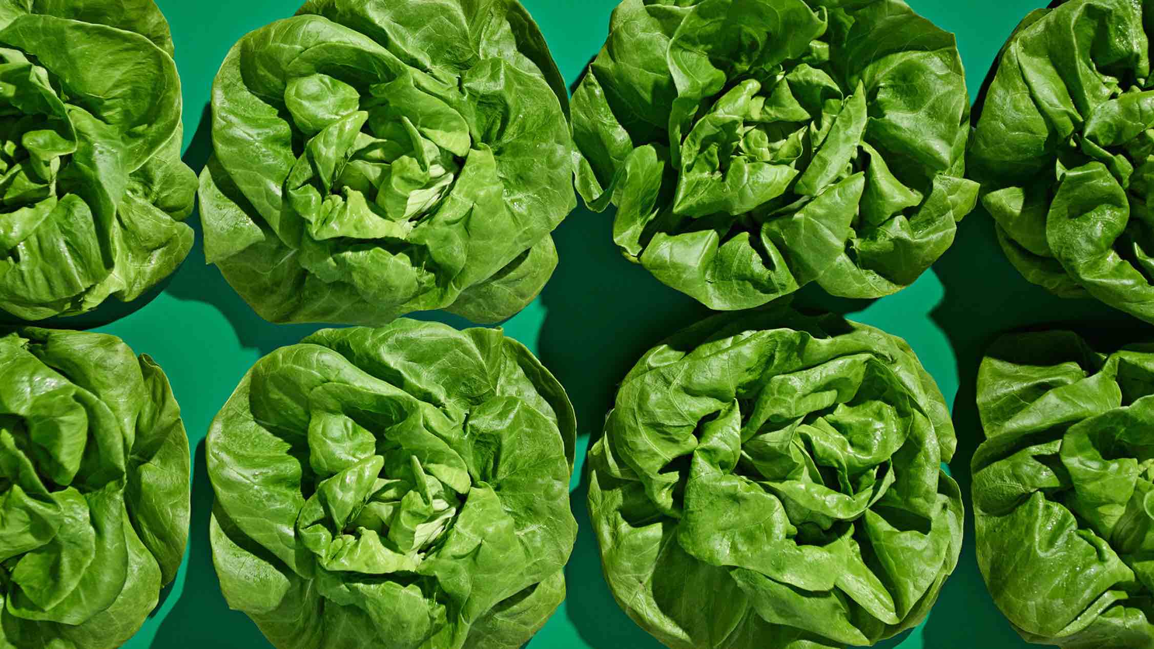
For example, Urban Barns’ cubic farming allows 475 heads of lettuce to be cultivated yearly on one square foot of land compared to only 20 in a greenhouse and 1.7 in a traditional field. And that’s not even the best thing about cubic farming.


You’ve heard about organic, but is that really enough?
TUX created iconography resembling the logo to help consumers understand the impact of the lettuce they are buying. To elevate the conversation from simply ‘organic’ to agriculture and consumer responsibility, TUX created Urban Barns’ own seal of approval for our products: gourmet & guilt-free.
- Gourmet, because Urban Barns’ greens are used by top chefs and have won numerous tasting competitons.
- Guilt-free, because you don’t have to worry about feeding your family harmful products or harming the planet.
![]()
![]()
“Guilt-free” at a glance
Keeping in mind that consumers don’t have the time to read while shopping for groceries, TUX developed a series of icons meant to rapidly share the benefits of purchasing an Urban Barns lettuce.
Cubic farming is sustainable, as it employs less energy and water than all other methods of farming. Because of the small footprint of the barns, they are situated closer to cities, which helps the local economy and cuts down on shipping. All Urban Barns products are grown from non-GMO seeds and, since they are raised indoors, they are protected from insects and extreme weather.

100% compostable packaging
Being at the forefront of an eco-frendly solution means you have to walk the talk, all the way down to the details. TUX brought the logo into consumer’s hands with this adorable sprout packaging.


A playful & gourmet variety
Lettuce can be fun, especially if you know about all it can offer. TUX created cue cards available at point of sale for consumers to try out recipes showcasing their award-winning produce. If you fall in love with the taste of a type of lettuce and can’t remember the name, just ask your spouse to grab the ‘red one’ on your grocery list.

Like fish at the market
For Urban Barns’ larger heads of lettuce, rather than using the traditional plastic clamshell, TUX encouraged people to take a sheet of recycled newspaper on which they printed (with soy ink) information about cubic farming. Not only is this solution more sustainable, but it keeps your lettuce fresher in the refregirator, as the newspaper acts as a moisture trap, preventing your lettuce from getting brown and mushy.

Making a statement
What better way to prove Urban Barns’ brand promise of growing more food with less space than to erect a flagship in one of the world’s most cramped cities. TUX have conceived and built multiple flagship stores, but never did they think they’d ever imagine one for a fresh food producer in the middle of New York City. It’s a ballsy move and that’s exactly why they did it. They couldn’t shy away from the opportunity of an actual ‘urban barn’. TUX’s goals with this concept store were to showcase Urban Barns’ new farming technology with a see-through structure, educate consumers on its workings and benefits, establish our produce as the world’s leading and finest, and finally, do it all where people would expect it least, to surprise consumers and lead the category by example.

A place to learn
TUX imagined this flagship so the whole family would enjoy dropping by, not only to pick up their weekly order of fresh produce, but also to eat and learn about modern farming and the impact it can have on society.

TUX and Urban Barns aren’t bringing plants back to the earth, but they want to bring people back to the farm. In this day and age, they’ve lost contact with the provenance of our food. They hope they can change this reality, one urban barn at a time.

Leave a Reply