Bringing a slice of Japan to Manchester
Alphabet, a branding and art direction agency from Manchester, UK, had developed, in a clever way, the branding and spatial design for Cha.ology. It is an unique Japanese Teahouse that has opened it’s doors in the heart of Manchester City Centre. The Teahouse aims to capture the tradition and heritage of Japan in a clean, sophisticated and contemporary way that works for the Westernised market. Alphabet worked alongside Hong Kong born founder of Cha.ology, Mei Lee on creating a contemporary brand that is firmly rooted in Japanese Heritage.


The Tatami System
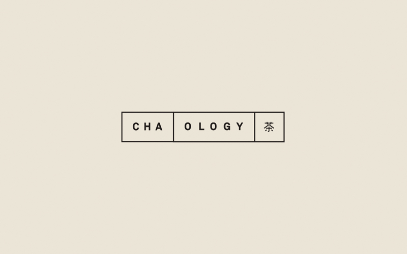
It was important that the overall identity for Cha.ology was heavily influenced by the traditional tea-drinking culture of Japan. Alphabet found their inspiration in the Tatami Flooring System. The tatami is a type of mat used as a flooring material in traditional Japanese-style rooms. They are made from a series of blocks that stack and slot together in a grid-like formation. Alphabet used this grid as a base for the brandmark. The words Cha.ology were split and placed inside different shaped Tatami blocks which then created a dynamic, interchangeable brandmark that references the environment and interior of the Teahouse.


Precision Meets Playfulness
Alphabet carried on the Tatami concept through into the grid systems that are used throughout the brand. The menus for example are made entirely of different sized blocks that stack and slot together to create a modern interpretation of the traditional Japanese culture. The menus needed to contain two columns which housed both English and Japanese translations and the grids helped Alphabet keep structure and a form to this process.
Alphabet also created iconography that had a similar minimalist approach as the key-line grids. The icons are used to help describe the complicated process of Japanese Tea Brewing to the customers who are less familiar with the experience.

Capturing the Product
Alphabet shot the Products how they are traditionally served, on a wooden board. Alphabet shot everything from an overhead angle as they wanted to recreate what the customer would see as the Tea is served in front of him. The overhead shots also allowed Alphabet to create consistency across how the products are displayed whilst also showing the variety of the Tealeaves and Teaware.


A Tranquil Environment
It was important to capture the tranquil environment of a Traditional Japanese Teahouse in the middle of one of the UK’s biggest and busiest cities. This was achieved through the use of neutral colours and raw materials combined with plenty open space and large floor-to-ceiling windows across the front of the store to let in the natural light.


A Digital Presence
The Tatami Grid system is carried into the Website and Social Media by combining with photography to create a minimalist and clear UI. The identifiable icon suite, keylines and neutral colour palette help create a user interface for the website and app that is easy to navigate and clear to understand.


Leave a Reply